
You may have seen an early version of this:

The black is sleek but after consulting an associate professor with specialization in this area, what's sleek may have to take a backseat to clearer contrast:

But then, if we're doing contrast, let's take it up a notch:

This next one was another idea from before. The webmaster mentioned to me that the little brush strokes are ambiguous enough to be music note heads or paint brush marks to represent the School as a whole, but somehow there doesn't seem to be a point of focus for the eye:

Then I got this idea of starting from scratch, upon a suggestion of seeing how the above designs might look over a white background:

I liked it, but then I realized that it resembled CNN's Election '08 coverage a bit too much. Enter a Photoshopped picture and some brush strokes:

And take in one suggestion of adding a little bit of simplicity:

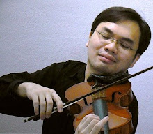
This little design endeavor is actually quite gratifying. Especially since I have bruised bones in my wrists, played through a recital with them, and now am taking some medically-advised leave from the instrument. But as they saying goes... that's another story.

1 comment:
not bad at all =)
Post a Comment